There are loads of web-pages that’ll helpfully track your travel progress around the world, displaying simple a choropleth maps. They’re nice and all, but why not make your own?
Why?
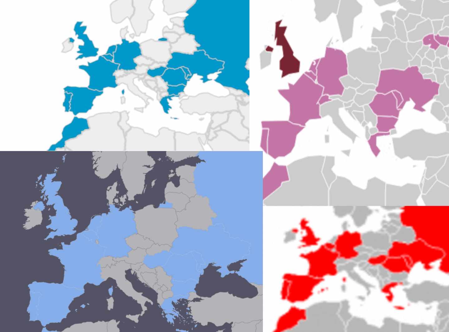
Despite lots of ready-made alternatives, there are good reasons to roll-your-own map, including:
- Dissatisfaction with existing maps
- Desire to tinker
- You haven’t written enough SQL today
- Stubbornness
Assuming at least one of those applies to you, let’s go.
How?
I chose to use CartoDB because it’s powerful, easy to use and free for projects like this (as long as you don’t your data to be private or more than 4 layers, you’re set). So sign up or sign in and let’s get started.
The data(set)
The first thing we need to do is get a data describing country borders, so we can fill in the ones we’ve visited. Luckily, CartoDB provides a library of external datasets for situations just like this. From your dashboard, go to your datasets and click New Dataset. From there, select the Data library tab and search for ‘borders’.
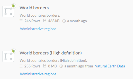
We’ve got 2 options, but don’t really need the high definition borders and they’ll make the map slower to load, so select World borders to continue. After a few seconds, you’ll have imported the data and have a new dataset called world_borders. You’ll need to turn off syncing, (as it is not possible to update data that is set to sync with an external dataset) by clicking the flashing notification in the top left corner and selecting never. Finally, let’s rename our dataset from world_borders to visited_countries_dataset by clicking on the name in the top left.

OK, so now we have a dataset called visited_countries_dataset that describes the borders of every country in the world. Good start. Click on the map view at the top of the page to see a visual representation of this.
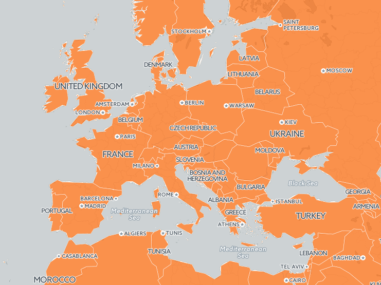
Every country is shaded. Obviously, we only want to shade the countries we’ve visited, so we’ll need to add that data to the dataset. Easy. Click on the SQL button on the right hand side of the screen to open the SQL query editor and paste in the following:
1 2 3 | |
What we’re doing is adding a column called visited of type boolean with a default value of false (given that you probably haven’t visited every country in the world). In some cases, I’ve found that the new column doesn’t appear, which seems to be related to a (caching?) bug. If that happens, try deleting the dataset and starting again - I haven’t found another solution to that issue, but we aren’t too far in, so it’s not a big deal.
The next step is manual - we need to update the data to mark the one’s we’ve visited. Simply scroll to the country you’ve visited, double click the false in the visited column and select true (to make things easier, you can sort by name by clicking in the header of the name column). Once that’s done, we can look at displaying this data on a map.
The map
If you click the map view at the top of the page while viewing your dataset, you’ll see that nothing has changed. That’s because we haven’t told the visualization to do anything based on whether or not you have visited the country (ie. whether or not visited is true). From here, we have a few options (all pretty simple), but I’ve decided to go with the most extensible option. If you’re impatient, just click wizards on the right edge of the screen, then click category and select visited as the column and you’re done - congrats. If you’re willing to put in a whole 2 minutes of work, come with me.
We’re going to create a separate map to display our visited countries. The map collects the data and defines the styling while the data remains data - it’s called Separation of presentation and content, and is a Good Thing.
Back out into your dashboard, switch to your Maps view and click New Map, then select the visited_countries_dataset and click Create Map - this will auto-create a layer (view) based on that dataset. Next, we’ll need to tell the map to only shade visited countries, so click the SQL tab on the right edge of the screen to see the following:
1
| |
This simply creates a view from your dataset by SELECTing from that dataset. One way of shading the visited countries is to simply filter this dataset based on that:
1 2 | |
You can achieve the same effect using a GUI by clicking the filter tab - either works just as well. Personally, I prefer to define styling rules as this allows us to do things with the un-visited countries as well (filtering them simply removes them from the view entirely). Click the clear view button in the SQL editor, then switch to the CSS tab and replace the contents with the following:
1 2 3 4 5 6 7 | |
All we’re doing is adding the [visited=true] constraint so we only apply the default styling where visited is true, leaving the remaining (visited=false) countries un-shaded. If you wanted to define another style for the unvisited countries, you could simply add another style with the constraint [visited=false]. You can also achieve the same effect using a GUI in the wizard tab. Nice that.

You can tweak the styling using CartoCSS or in the wizard tab. The infowindow tab allows you to set what appears when you hover or click on each country - you could have the name of the country or even the date you first visited it if you’re willing plug in the data like we did above. The appearance of the map and which controls appear on it can be changed by messing around with the buttons in the bottom left corner of the map. Finally, name your map something memorable - if you send people a link to a full screen version of your map, this is what they’ll see in their title bar. I went with Steve’s visited countries. When everything is tweaked to your liking, simply click the Publish button for options. Here’s an embedded version of my map:
Click the visible layers button in the top right to switch between different visualisations of visited US states, which are described in detail below.
Extras
The above build is what I’m using, but it’s easy to extend and tweak. Let’s look at a few options to customize or extract data from the map.
Stats
Most maps offer some stats to display; visited countries count, percentage of world visited etc. It’s quick and easy to calculate these sorts of things with SQL:
1 2 3 | |
1 2 3 4 5 6 7 8 9 10 11 12 13 14 15 | |
1 2 3 4 5 6 7 8 9 10 11 12 13 14 15 | |
OK, technically, that last one calculates the percentage of world land area covered by the countries you’ve visited, not really the area you personally have covered. The whole thing is silly, but I’ve seen other maps (like mytravelmap) do this kinda calculation, so I put it here for comparison. Remember, measure your trip in people, not kilometers.
Mark states individually
So far, we’ve created a map of visited countries, but what if we want to get more specific and mark individual states or regions that we’ve visited? Luckily, just as CartoDB provides datasets for country borders, it also provides state, region and county maps for lots of countries as well. For this example, we’ll do US states, but you can apply this to any set of regions you can find in CartoDB’s data library (or can find GeoJSON/KML to import).
Hop back to your dashboard and create a new dataset from the dashboard, search the Data library for ‘United states’ and select the dataset USA states to import it. As before, you’ll need to turn off syncing, (optionally) rename it (I went with visited_us_states_dataset) before running the following SQL:
1 2 3 | |
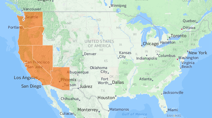
As long as the table name is correct, you’ll now have a visited column in your table. As before, fill it in manually to mark the states you’ve visited. From here, we could create a separate map just and define styling options just as we did before, leaving the map looking something like this:
Alternatively, we could include this dataset as a layer in the map we created earlier, which gives us lots more options. Let’s do that. Back on your original Visited Countries map (not the dataset), click the blue + button near the top right and select the visited_us_states_dataset we just created to create a layer from it. Then, simply define your styling as before so we only shade the visited states. If we displayed the map now, we’d overlay both datasets on eachother, which kinda defeats the purpose of the exercise:
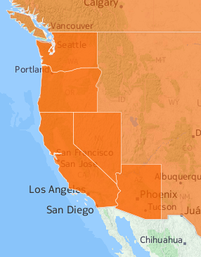
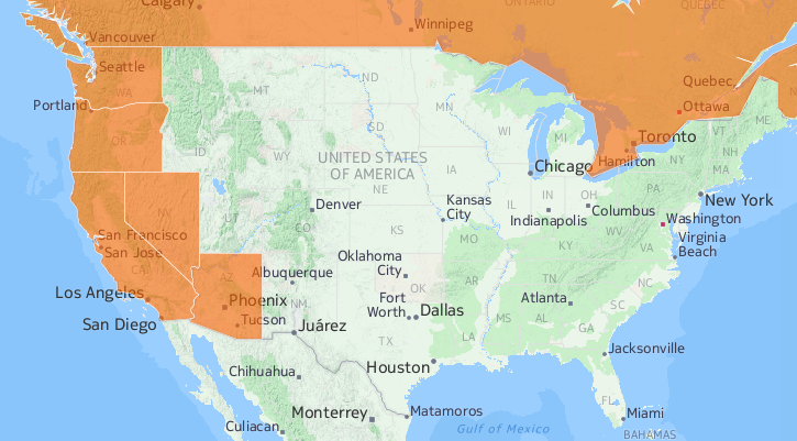
One option is to go back to the original visited_countries_dataset and mark the US as un-visited, which would solve the problem but break the stat queries from the previous section (the visited countries count would be off). The simplest solution would probably be to keep the USA marked as visited, but filter it out in the map view with some SQL:
1 2 | |
Which would leave us with a map that looks something like:
You could also mash both dataset into a single layer with a bit more SQL:
1 2 3 4 5 6 7 8 9 10 11 12 13 14 15 | |
This is necessarily lossy as the two datasets have different columns, but allows you to use your other layers freely - something I’ll be looking at in a later post. That’s enough for now, enjoy your maps.